I downloaded a book summary app a while back. One of those “read a whole book in 15 minutes” promises that appear everywhere when you’re burnt out and looking for a shortcut to feeling better.
The onboarding was impressive. A questionnaire that asked about my focus, my goals, my struggles. It felt personal. It felt like it understood me. I spent several minutes filling it out, genuinely engaged, thinking this might actually help.
Then it took me to a payment screen. Eighty pounds, with no clear explanation of what I was actually buying.
I closed it and never went back.
That experience stuck with me. Not because I was angry about the money, I hadn’t even paid. But because I’d just watched a wellness product use my own vulnerability as a conversion mechanism. The questionnaire wasn’t designed to help me. It was designed to get me invested enough that I’d hand over my card details.
That’s not a mental health tool. That’s a sales funnel wearing a meditation cushion.
The business model nobody talks about
Apps like Headspace and Calm are genuinely well-designed products. The interfaces are calming, the content is good, and for many people they provide real value. That’s not the argument here.
The argument is about what happens underneath the surface, where the actual business decisions live.
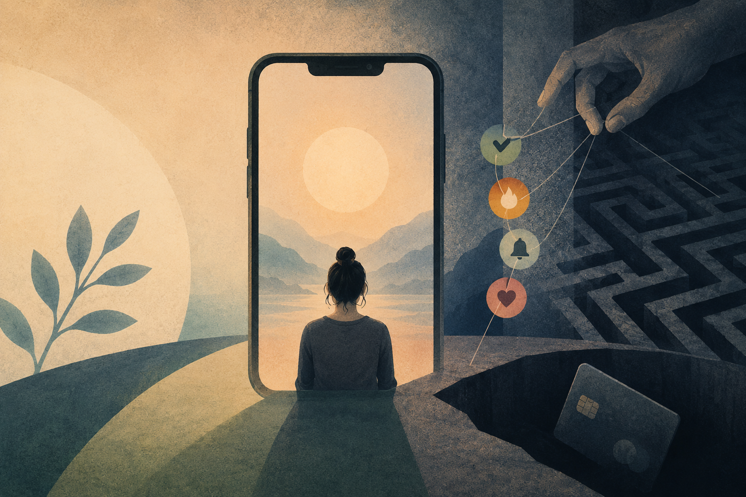
Mental health apps are consumer products. They live and die by daily active users, retention rates, and subscription revenue. The metrics that matter to their investors are the same metrics that matter to Instagram or TikTok. And the UX patterns that drive those metrics, streaks, guilt-triggered notifications, loss aversion mechanics, are borrowed directly from the engagement playbook that social media companies refined over the past decade.
A 2025 paper in Frontiers in Psychiatry put it plainly: streak-based incentives in apps like Headspace and Calm promote habitual use over genuine improvement, with engagement-driven strategies mirroring those used in social media addiction models, risking prioritising user retention over genuine therapeutic benefit.
The conflict of interest is structural. A recovered user who no longer needs the app is a churned subscriber. The business incentive and the therapeutic goal point in opposite directions.
What streaks actually do to you
Duolingo is the clearest case study because it is the most honest about its own mechanics. The streak is the product. The language learning is the justification.
By 2022, most of Duolingo’s daily active users were maintaining an active streak. Retention was high. But people weren’t logging in to learn anymore. They were logging in so they didn’t lose. They’d open the app, tap a few buttons, and close it. Hollow engagement that looked perfect in a dashboard and meant almost nothing in terms of actual learning.
A 2024 peer-reviewed study found that after 27 hours of use over three months, Duolingo users remained at beginner to low-intermediate proficiency. The streak kept them coming back. It didn’t make them better at Spanish.
Now apply that same dynamic to a mental health app. The streak keeps you opening it. The guilt notification pulls you back when you haven’t. But the fear of breaking a streak outweighs the joy of extending it, shifting the mechanic from motivator to source of anxiety. You are now anxious about your anxiety app.
The research on whether engagement actually translates to outcomes makes this worse. A systematic review found the correlation between engagement metrics and clinical outcomes in mental health apps has an effect size of just r=0.16, with the authors concluding that engagement alone is unlikely to drive meaningful clinical change in isolation. Logging in is not the same as getting better. The industry measures the first and sells it as the second.
The notification problem
I used Famous for a while. Beautifully designed. But the notifications came so frequently, so urgently, so relentlessly guilt-laden, that I found myself becoming rebellious against the app rather than engaged with it.
“You haven’t meditated in a while. Everything okay?” Thanks, Headspace. I was fine until you asked.
This is what researchers call confirmshaming, framing the opt-out as something to feel bad about. The alternative to engaging with the app is positioned as a personal failing. Miss a day and the app acts like you’ve let yourself down.
For people living chaotic, non-linear lives, which is most people, and disproportionately the people who most need mental health support, this creates the opposite of what the product claims to offer. The tool designed to reduce anxiety becomes a new source of it.
I’m not sure whether I’m neurodivergent, but I know I work best when something feels like my idea rather than an obligation being enforced on me. The moment an app starts feeling like a nag, I’m done with it. That’s not a personal failure. That’s a design failure.
The onboarding trap
The book summary app I described at the start is an example of a well-documented dark pattern in health apps. A 2023 paper specifically identified vulnerable populations as being disproportionately harmed by deceptive design in health and wellness contexts, where the emotional investment created during onboarding is used to lower resistance to purchase rather than to deliver care.
The pattern is simple. Ask someone about their struggles. Make them feel understood. Then present a paywall before they’ve received anything of value. The questionnaire was never diagnostic. It was persuasive.
Research into dark patterns in digital health applications found that developers frequently deploy manipulative design strategies, intentionally or unintentionally, to push users toward decisions that serve the business rather than the user. The unintentional qualifier matters. Not every bad design is cynical. But the effect is the same regardless of intent.
What good actually looks like
I built a gratitude app for myself called Kansha. It is a simple gratitude app that uses a Chrome extension to remind me, so it sits where I already spend most of my time without requiring me to go somewhere new.
No streaks. No guilt language. No confirmshaming. If you want email notifications or in-app reminders you can set them up, but nothing is forced. You actively specify what you want rather than opting out of defaults designed to maximise engagement. An optional weekly digest email with a summary of your week’s gratitude. Pick it up when you want to, put it down when you do not.
The design decision was not sophisticated. It came from asking a simple question: does this product make me feel worse when I do not use it? If yes, something is wrong.
That question should be standard in mental health product development. It isn’t.
There are better frameworks emerging. A 2026 piece in Smashing Magazine documented an approach that replaces punitive streaks with cumulative progress mechanics, acknowledging that healing is non-linear and that a missed day is not a failure to be flagged. Core coping tools are never gated behind engagement mechanics. Coming back after a break is framed as resilience rather than recovery from failure.
A UX design guide from Gapsy puts it well: dashboards can quickly become a source of pressure instead of clarity, and a broken streak can trigger a shame spiral in someone who missed a day because they were struggling. The people most likely to miss a day are the people who most needed to use the app.
Consistency is a worthy goal. But consistency built on fear of loss is not the same thing as consistency built on genuine value. One keeps you coming back. The other keeps you well.
The question worth asking
Mental health apps are not going away. The market is growing, the need is real, and for many people these tools provide genuine support. The problem is not the category. It’s the incentive structure that most products in the category are built on.
If your product measures success in daily active users but not in whether users are actually improving, you are optimising for the wrong thing. If your notifications are designed to create anxiety about not using an anxiety app, something has gone badly wrong. If your onboarding exploits vulnerability to drive conversion, you are not a wellness product.
The tech-for-good space talks a lot about intention. But intention doesn’t show up in the UX. Design decisions do. And the design decisions that make investors happy are often the ones that make vulnerable users feel worse.
The simplest test I know: would you recommend this product to someone at their lowest point? And if they stopped using it for a week, would the product make them feel guilty about that?
If the answer to the second question is yes, start there.
–
If you are struggling and need to talk to someone, free and confidential support is available wherever you are.
UK: Samaritans · Mind · CALM
US: 988 Suicide and Crisis Lifeline (call or text 988) · Crisis Text Line (text HOME to 741741)
Australia: Lifeline (13 11 14) · Beyond Blue
Canada: Talk Suicide Canada (1-833-456-4566) · Crisis Services Canada
International: Find A Helpline connects you to free mental health support in over 80 countries.